Protocubist Ringer T-Shirt in Black, White and Flesh Through MINISLIMITED
Get This T-Shirt Now $31 See The Whole Range of T’s
Traditional Graphic Design work by Elliott Earls. This is work is traditional in that it attempts to (relatively) transparently communicate the values of a third party through the work. In the design process the flagrant agency of the designer is downplayed. “To my mind one of the major issues that clearly delineates traditional design work from “experimental” work is the degree to which the agency of the designer, is sublimated in the interests of a corporate entity (the “client”). In other words, is the agenda of the designer in harmony with the explicit goals of the client? You may be thinking, ‘Is that not a simple definition of effective design?’ While a high degree of alignment between the goals of the designer and client is what is taught in design school, at the highest levels of the design process the opposite is at play. At the highest levels of the cultural food chain there is dramatically less alignment between the explicit goals of the designer and client. Paradoxically this leads to better design. Why? You wouldn’t instruct your surgeon on how to remove your spleen would you?” – Elliott Earls

Get This T-Shirt Now $31 See The Whole Range of T’s
")
Declare your defiance in the face of institutionalized stupidity in this American Apparel Tri-Blend (50% Polyester / 25% Cotton / 25% Rayon) construction • Polyester retains shape and elasticity; Cotton lends both comfort and durability; addition of Rayon makes for a unique texture and drapes against the body for a slimming look Go to minislimited […]

In Episode 18 of Studio Practice, I referred to a précis (a diagram) of my argument outlining the “problem” with the field of Visual Communication and Graphic Design. you can find a .PDF file of the précis below. See Episode 18 for an explaination. Download a high resolution version of the précis by clicking on the link below: Episode 18 […]
What’s the “problem” with the field of Visual Communication and Graphic Design? In this episode of Studio Practice, Elliott Earls discusses the relationship between philosopher Morris Weitz Open Concept of Art, and it’s relationship to design. Part 2 will continue the argument. SUBSCRIBE to the channel here: https://goo.gl/L4FsHI Purchase a limited edition print or sculpture by […]
In this episode the British teddy-boys, mods, skinheads and punks serve as a point of departure for Elliott Earls to make a case against the global influence of Dutch graphic design. Elliott draws on the work of Dick Hebdidge and his theory of subculture development to suggest another method for moving your work to a […]
Is there a necessary correlation between “sweat equity” (labor) and the way a work of art/design is perceived? What’s the relationship between time and the quality of a work? In what ways are direct forms of visual art and design problematic? Must work show evidence of “difficulty” of manufacture in its’ final form? In this episode […]
 by Elliott Earls")
In October of 2015 I was asked by former Cranbrook Art Museum Director Gregory Wittkopp to design a catalog for the museums collection of Pewabic Pottery. The two images below were from the initial design presentation. In both covers I reinterpret William Morris wall paper samples from the Cranbrook Collection in an attempt to show just […]

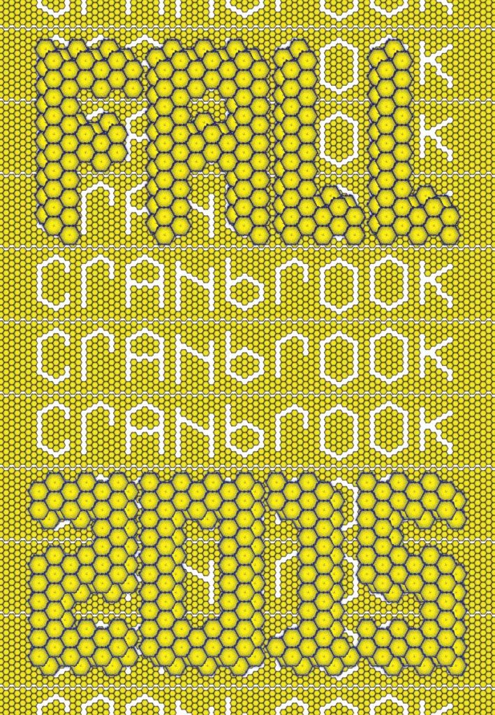
This is the Fall 2015 Lecture Series Poster for Cranbrook academy of Art designed by Elliott Earls. Twitter Instagram YouTube

Earlier this week I had an extended conversation with Mitch Goldstein and Nancy Bernardo from the ThroughProcess Podcast series.

I was recently contacted by Nick Vokey the Creative Director at MIT Technology Review to design the cover for the “10 Breakthrough Technologies 2015” issue. The images below are the cover and the inside cover images. Selected images from the design proposal phase of the project Design Direction A1 Design direction A1 submitted to the CD early […]
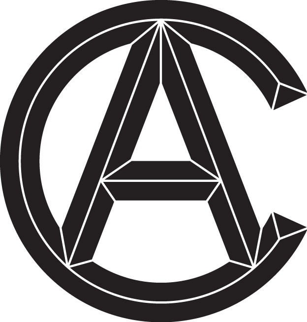
In 2011 I was asked by then Director of Cranbrook Academy of Art, Reed Kroloff, to redesign the identity system for the Academy. After extensive research on the history of logos at the Academy, I began a two year long design process that produced the logo shown above and the identity system below. The typeface […]

I was asked by Greg Wittkopp director of Cranbrook Art Museum to design the catalog for the exhibition “My Brain Is In My Inkstand.” This is the result.

Watch Elliott Earls 2013 Cranbrook Academy of Art Artist-in-Residence lecture here. Among many other topics, Earls lays out a business model for aesthetic practice. Images from the Talk… A Business Model for Aesthetic Practice Never Forget Skillz Pay Billz Image from 2013 Lecture

Over the course of the last two weeks I’ve been designing a new identity system for the gallery WassermanProjects. The logo above is one component of the system. As the system takes shape I’ll publish more here.
")
One of many projects currently underway in the studio is an identity system for the Earls summer studio on Lake Leelanau. This large cedar sign is one of the elements of this system.

“Elliott Earls’s reinterpretation of Norman Rockwell’s “Four Freedoms” practically screams. A little girl seems to be crying, her eye bruised, with an American flag in the background and two words framing her figure: “Liberty Weeps.” The color scheme is red, white and blue, but patriotic pride has been supplanted by sadness. Elliott Earls’s poster “Liberty […]

In 2005 I was asked by Cranbrook Academy of Art to exhibit recent work. I named the work “Bull and Wounded Horse.” This was the logo I developed for the exhibition.

I continue to back fill the new website with old work. Here is a poster from 2001.